


Niagara Launcher ‧ Home Screen
4.85.69K Reviews
App Specs
- Version
- 1.16.31
- Updated On
- License
- Free
- Downloads
- 10,000,000+
- Developer
- Mellowdrop Studio
- Categories
- Personalization
- Platform
- Android, iOS
Screenshots
 Analysis by AppCompare
Sharing a phone at home can turn a home screen into a small source of friction: one person wants quick access to messages, another wants a simple way to open a reading app, and a child may only need a few familiar icons. I like Niagara Launcher ‧ Home Screen for the way it keeps the main screen calm, but I would treat it as a personal layout—not as a system for separating people or managing a shared device. That distinction matters before anyone makes it the household default.
One phone, several routines
Picture a family member borrowing your phone to check a calendar entry while you are cooking. A short list of chosen apps can make that handoff less confusing than a busy grid, especially for someone who does not remember where every icon lives. The vertical app list is also handy when I am carrying groceries or holding a bag: I can move through names rather than aim at a tight cluster of icons.
That convenience has a boundary. A launcher changes how apps appear and are reached; it does not, by itself, create separate accounts, hide personal content, or decide what another person is allowed to open. If a device regularly changes hands, I would use the phone’s own user or account options where available and avoid handing it over unlocked with the expectation that a tidy home screen acts like a privacy barrier.
Make the home screen a deliberate handoff
For a shared-use moment, I would keep only the apps needed for that task among the favorites, then leave the rest of the household’s routine out of the way. For example, a parent passing over a phone to show a saved recipe can make the relevant app easy to find without turning the whole screen into a directory of personal habits. The trade-off is that the owner still needs to supervise the handoff and return the device to their own routine afterward.
This approach works best when the same person remains responsible for the phone and the other person is borrowing it briefly. If two adults need independent access throughout the day, separate devices or proper device-level accounts are a better fit than trying to solve that arrangement through launcher customization. Niagara can make navigation feel clearer, but it cannot resolve the social question of whose notifications or apps are visible.
Keep setup personal, not falsely private
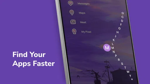
I would start by selecting a small set of everyday favorites, then use the full app list when something less frequent is needed. That gives the home screen a clear purpose without requiring a perfect filing system. It also helps when routines change: an app used for a short project can be removed from favorites instead of being allowed to crowd the first screen indefinitely.
There is a useful distinction between a launcher that feels private because it is uncluttered and a device that is actually private. A clean layout may reduce accidental taps, but it should not be treated as a lock, a child account, or a way to conceal sensitive apps from someone who can use the phone. If privacy or age-appropriate access is the main concern, I would configure those protections at the operating-system or app level first.
Worth Reading Before You Choose

Baby Panda World Brings Quick Play to Modern Phones, but Its Game Library Feels Busy

ESPN’s Live Game View Makes Following Close Games Easier

QuizzLand Review: A Good Fit for Short Trivia Breaks, Not Every Player

Basketball Stars: Multiplayer Is Fast, but Can It Recover When Matches Go Wrong?

WEBTOON Turns Phone Updates Into a Better Reading Routine

Link to Windows Runs on Shared Habits, Not Social Feeds
A Fresh Take on Home Screens
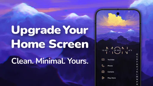
If you're anything like me, you've probably tried a bunch of launchers, hoping to find the one that feels just right. Niagara Launcher does something different. It strips away the clutter and focuses on what really matters: easy access to your apps and information. The first time you open it, the simplicity hits you. It’s like a breath of fresh air.
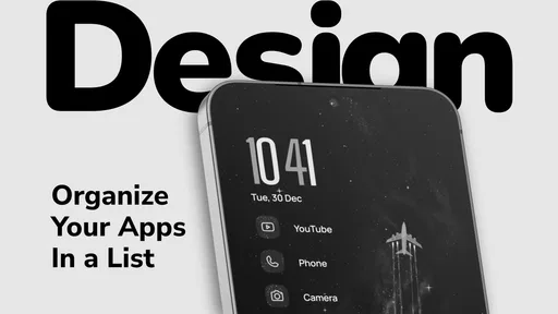
Instead of the usual grid of app icons, Niagara gives you a sleek vertical list of your favorite apps, right on your home screen. This means less scrolling and more doing. Honestly, I found this approach super intuitive. It’s perfect for those who, like me, want to keep things straightforward and efficient.
Where a list beats a grid—and where it doesn’t
Compared with the standard icon grid, Niagara asks you to browse by app name and position rather than scan several rows at once. I find that especially useful when I already know what I want to open and would rather move directly through a list than hunt across pages. The list can also make the phone feel less like a collection of brightly colored invitations to tap and more like a tool with a few clear starting points.
The same choice is not ideal for everyone. If you rely on visual grouping, widgets, or a carefully arranged multi-page layout to distinguish work, hobbies, and home life, a conventional launcher may feel more natural. People who enjoy constantly rearranging a rich home screen may find Niagara’s restrained approach limiting, even if its simplicity is exactly what another person wants.
Customization Without the Overwhelm
One of the things I love about Niagara Launcher is how it balances customization with simplicity. You can easily add or remove apps from your favorites, and the launcher learns which apps you use most often, adjusting the list accordingly. This makes it feel almost like it’s reading your mind.
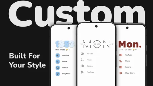
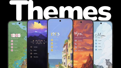
And if you’re into aesthetics, Niagara doesn’t disappoint. You can tweak the theme to match your vibe—whether you’re into dark mode or want to splash some color. The fonts and icons are clean, and there’s no clutter to distract you. It’s all about making your phone feel personal without overwhelming you with options.
Set a routine before letting the list evolve
One small habit makes the adaptive favorites more useful: I would begin with a few apps that matter every day, then give the launcher time to reflect how I actually use the phone. That is more practical than trying to predict every future shortcut on day one. If an app appears in the routine because of a temporary burst of use, reviewing favorites now and then keeps the first screen from drifting away from what I need.
This is a gentle kind of personalization rather than a full home-screen workshop. It suits someone who wants a little control over appearance and access but does not want to spend an evening tuning every detail. If your satisfaction comes from fine-grained layouts and lots of visible controls, you may prefer a launcher built around that style instead.
Notifications Done Right
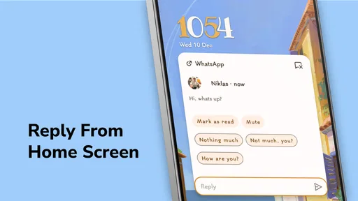
Now, let’s talk notifications. We all get them, and sometimes they can be a headache. But Niagara handles them beautifully. Instead of tiny icons with unread numbers, your notifications appear right next to the app in use. This makes it easy to see what’s important at a glance. Plus, you can easily swipe them away when you’re done.
This feature really resonated with me because it helps keep my screen tidy and ensures I don’t miss anything crucial. It’s practical and streamlines how you interact with your phone.
Use the glance as a prompt, not a household inbox
When I am between tasks, seeing a notification beside its app can help me decide whether to open it now or leave it alone. For instance, while getting ready to leave, I can check whether a message needs attention without scanning a crowded notification area first. That is useful for personal triage, but it does not make notifications shared or coordinated: another person using the device may see what is on screen, so I would keep sensitive conversations in mind before handing over an unlocked phone.
For households, the practical benefit is less visual noise, not automatic coordination. A launcher cannot tell family members which message belongs to whom or prevent someone from opening the wrong app. I would keep notification visibility and any sensitive app access in the phone’s broader privacy settings, then use Niagara for the simpler job of making everyday navigation easier.
Light and Fast
Performance is another area where Niagara Launcher shines. It’s lightweight, so it doesn’t bog down your phone’s performance. I’ve noticed my device runs smoothly, with less lag compared to some other launchers I’ve tried. This is a big win for anyone who values speed and efficiency.
Plus, the app is designed to be battery friendly. So, if you’re often on the go, this launcher won’t be the reason your battery’s drained by midday. That’s a huge plus in my book!
Who is likely to enjoy living with it?
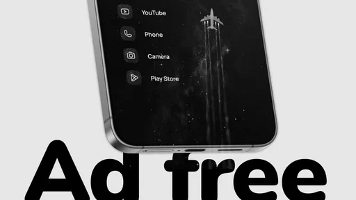
I would recommend trying it if your current screen feels crowded, you tend to open the same handful of apps, or you want a one-hand-friendly way to move around the phone. It is also a sensible choice for someone setting up a less intimidating home screen for a relative who prefers app names and a short list to many pages of icons. Since the app is free to install and includes no ads, it is easy to explore the basic experience without making the decision hinge on an upfront purchase.
It is less convincing for someone who wants the home screen itself to function as a dashboard full of widgets, visual folders, and distinct work and personal pages. A parent who needs robust child restrictions should look to dedicated device controls rather than expect a launcher to supply them. And if several people use one phone as their own, the right answer is usually account separation or a different device arrangement, not simply a different launcher.
What to know before switching
Niagara Launcher is a personalization app developed by Peter Huber. It has a 4.8 average from around 174,000 ratings, with roughly 4,600 written reviews and more than 10 million installs. Those numbers suggest that its focused style has found a sizeable audience, but they do not mean the list-based approach will suit every person. I would judge it by whether the first screen helps you reach your own daily apps more easily, not by popularity alone.
It is free, rated for Everyone, and its current version is 1.15.9; it runs on Android 5.0 and later. Optional in-app purchases range from $0.99 to $42.99 per item. The app was released on January 30, 2021. I would treat purchases as optional rather than necessary to decide whether the basic layout fits your habits, and check the options in the app before spending if you are curious about paid extras.
One practical question is whether switching means giving up the familiar arrangement you already have. Any launcher change asks you to learn a different route to apps, so I would try it during a calm part of the day rather than just before a commute or a busy morning. Give yourself enough time to add the essentials and test the list with your actual routine. If it feels slower after a fair trial, returning to a grid-based setup is a reasonable choice, not a failure to adapt.
Wrapping It Up
Overall, Niagara Launcher ‧ Home Screen is a fantastic choice if you’re seeking a minimalist and efficient launcher. Its ability to adapt to your usage, combined with an elegant design, makes it a standout option. I’ve genuinely enjoyed using it, and it’s become my go-to launcher.
If you’re tired of the same old cluttered screens and want something that feels fresh and intuitive, give Niagara a try. It might just be the change you didn’t know you needed.
My household verdict
For a household, I see this as a strong personal launcher that can make one person’s daily phone routine feel calmer, not as a shared-device management tool. Its short list can make a brief handoff less confusing, and the uncluttered screen is approachable for people who do not want to learn a complicated layout. But account boundaries, child access, and sensitive notifications still need attention beyond the home screen.
I would choose Niagara when the main goal is simple, quick access to familiar apps, especially on a phone used mostly by one person. I would skip it—or pair a different approach with it—when the priority is rich widget layouts, extensive visual organization, or genuine separation between household members. That is the most useful way to think about it: a distinctive, low-clutter front door to your apps, rather than a substitute for the phone’s privacy and sharing controls.
Pros
- Intuitive gesture controls.
- Minimalist design enhances usability.
- Customizable app drawer.
- Smooth performance on older devices.
- Widget integration is seamless.
Cons
- Limited widget options available.
- No support for landscape mode.
- Lacks advanced customization.
- Occasional lag with large app lists.
- Paid features in pro version.
FAQs for Niagara Launcher ‧ Home Screen
What is Niagara Launcher and how does it differ from other launchers?
Niagara Launcher is a minimalist and efficient Android home screen replacement app designed to streamline your phone experience. Unlike traditional launchers, it offers a simple and intuitive interface with a vertical app list, making it easier to access your favorite apps quickly. Its focus on simplicity and speed sets it apart from more complex launchers.
Is Niagara Launcher customizable?
Yes, Niagara Launcher offers several customization options to tailor the home screen to your preferences. Users can change icon shapes, choose different themes, and even personalize the app list to highlight frequently used apps. However, it maintains a minimalist approach, so customization options are straightforward and not overwhelming.
Does Niagara Launcher affect phone performance or battery life?
Niagara Launcher is optimized for performance, ensuring it runs smoothly without draining battery life. Its lightweight design means it uses minimal system resources, making it ideal for both older devices and newer models. Users generally report improved efficiency and responsiveness compared to more resource-intensive launchers.
Can I access widgets with Niagara Launcher?
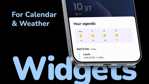
Yes, Niagara Launcher supports widgets, although it integrates them differently than traditional launchers. Widgets can be accessed directly on the home screen, maintaining the app's minimalist aesthetic. This allows users to enjoy the functionality of widgets without cluttering the interface.
Is Niagara Launcher available for free?
Niagara Launcher is available as a free download, offering essential features that cater to most users. For those seeking additional customization and features, a pro version is available through a subscription or one-time purchase. The pro version includes advanced options like custom gestures and more theme choices.


